
Market Commentary— Through the Tandem Lens
With 2024 now in the books, it was certainly another good year for the S&P 500. The index gained more than 20% for the second consecutive year and the third time in the past four years. Interest rates moved higher throughout the year, which historically has been a headwind for stocks. But for whatever reason, that didn’t matter to us equity investors as markets rallied regardless. Returns were concentrated among the largest companies. The Magnificent Seven (consisting of Apple, NVIDIA, Microsoft, Amazon, Alphabet, Meta, and Tesla) continue to be written about because they continue to dominate markets. For good measure, and after a year like last, we might also include Broadcom with this group. These eight companies now account for more than 35% of the index. What’s more, in 2024, these eight companies accounted for more than 55% of the S&P 500’s return.
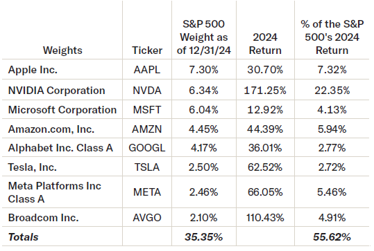
Source: FactSet
The concentration within the index is unprecedented. According to Goldman Sachs Global Investment Research, the 10 largest companies in the S&P 500 account for more of the total market than at any point in at least the past 45 years. That means that the S&P 500, which is often viewed as a diversified index, is becoming increasingly less diversified and increasingly concentrated. This period of heightened concentration coincides with a time in which the market has become historically expensive once more.
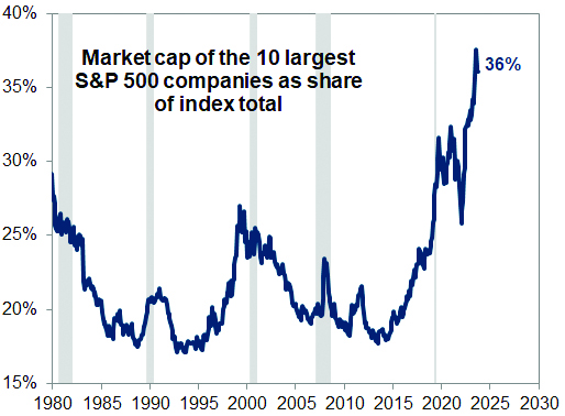
Source: FactSet, Compustat, Goldman Sachs Global Investment Research
Some are familiar with a P/E ratio as a measure of valuation. It simply divides price by earnings to help an investor determine how much they are paying for a stock given how much profit a company earns. A lesser-known valuation tool is the Cyclically Adjusted Price to Earnings Ratio, or CAPE. A CAPE ratio attempts to smooth the cyclicality of corporate earnings and the economy by dividing price by the 10-year average earnings for stocks. The accompanying chart illustrates both peaks and troughs in the valuation metric since the 1880s. The higher the CAPE ratio, the more expensive stocks are. Today’s CAPE ratio is only exceeded by the impressively high valuations of the late 90s, before the bursting of the Dot Com Bubble, and in 2021, prior to a 25% fall in the market throughout 2022.
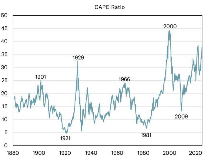
Source: Professor Robert J. Shiller
Now, one might ask, why does this matter? The CAPE ratio was elevated coming into 2024 and we already discussed how great of a year it was for the index! The CAPE ratio is not necessarily predictive of anything. However, it can help identify risks and help define what seems reasonable in terms of return expectations moving forward. The following chart has taken the CAPE ratios from the chart above and plotted those points along the bottom x-axis with 10-year forward returns plotted across the leftward y-axis. The better the forward returns, the higher the dot. The more expensive the market, the more rightward the dot is. As one can see, the best returns occur from lower CAPE ratios. Some of the worst returns occur from higher CAPE ratios. The red vertical line marks today’s CAPE ratio. 10-year forward returns have never earned an annualized return better than 1% from this valuation level. If history is any indication of the future, then the index faces a strong headwind given present valuation.
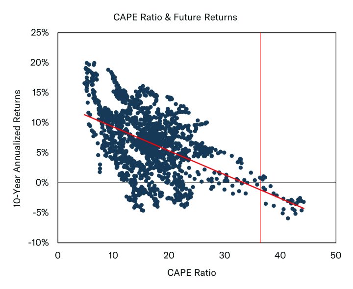
Source: Professor Robert J. Shiller
The idea that future returns may be fairly limited is not news that I am breaking. Within the past few months, Goldman Sachs, Bank of America, and Vanguard have all discussed the possibility of lower returns over the next decade. Goldman predicted that the S&P 500 would deliver 3% annualized returns over the next decade. Bank of America suggested 1-2% annualized returns. Vanguard’s return predictions were a bit more optimistic as they forecasted annualized returns to be somewhere between 3.4% and 5.4% over the next decade. That may be a tough pill to swallow for many investors. The prospect of limited future returns can be scary.
However, it’s worth noting that Goldman, BofA, and Vanguard are talking about index level returns. They are not talking about the returns for all stocks. They are simply talking about what they predict will happen to the S&P 500 over the next decade. Let’s quickly recap – the S&P 500 is more concentrated than it has been in decades and is extremely expensive from an historical perspective. Now, we normally do not make any sort of predictions in this space, but it seems reasonable to think that the future returns may be more limited for these market leaders.
That is in part because the largest companies change naturally and consistently. Thirty years ago, the largest companies in the S&P 500 consisted of companies like AT&T, GE, Exxon, Royal Dutch Petroleum, Wal-Mart, NationsBank, Phillip Morris, and some of the Bells. By the turn of the century, some of the largest companies were Microsoft, Cisco, Intel, Lucent Technologies, IBM, and America Online. A decade after that, Exxon, Microsoft, Apple, Proctor and Gamble, Johnson and Johnson, and AT&T once more. Today, it’s the Magnificent Seven. My point is, leadership changes. That shouldn’t be shocking. It would be shocking to me if all of the largest companies today were still the largest companies 10 years from now though. What’s different today versus 1995, 1999, and 2009 is how concentrated the index is relative to those times. If the top stocks falter today, it will likely mean more pain for the index than it has previously because it is more heavily weighted towards those top names. That does not necessarily equate to more pain for all stocks.
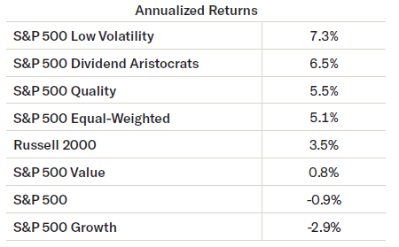
This also need not spell doom and gloom for all equity investors either! It may not be great news for passive investors should Goldman’s prediction come to fruition, but it certainly does not have to be bad news for all equity investors. The last time we had a lost decade was during the 2000s. From December 31, 1999 to December 31, 2009 the S&P 500 had a total annualized return of -0.95%. For an entire decade, one would have been better burying cash in their backyard and digging it up ten years later versus being invested in the S&P 500. However, there were still plenty of money-making opportunities throughout the decade, despite the S&P 500 falling 49% from March of 2000 to October of 2002 and then another 57% from October 2007 to March 2009. For example, Low Volatility did quite well, as did Dividend Growers (as measured by the S&P 500 Dividend Aristocrats index) and Quality. The S&P 500 Equal-Weighted Index had positive rates of return.
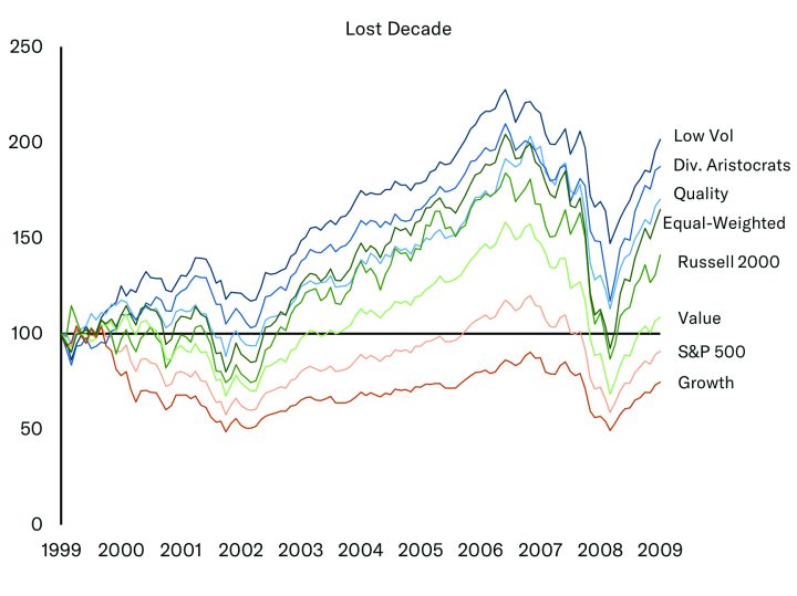
To make money during the Lost Decade, it helped to be invested differently. It helped to not be passive. If Bank of America, Goldman Sachs, and Vanguard are all right going forward, and if history serves as a guide, it might make sense to again be invested with a willingness to be different from the index.
At Tandem, we strive to own companies that can consistently grow through different economic cycles. We want steady growers. Steady growers, in our opinion, can deliver steady returns. At least for this writer, steady returns lead to a more peaceful investment experience. And, as we show in Volatility Revisited, steady returns that lose less does not have to mean one ultimately earns less over different time periods!
Commentary— Volatility Revisited
A holiday tradition in the Carew household is the running of the Turkey Trot. I’m certainly not the world’s fastest runner, but I keep my pace pretty steady for the entirety of the race. I’m a boring runner. I have a friend that runs with us who approaches running very differently. As soon as the 5K starts, he is out of the gates full sprint. Half a mile into the race and I won’t even be able to see him anymore. However, usually around the first mile, I pass him. I am still running my steady 8:30/mile pace, but he’s now walking – completely gassed after his ¾ mile sprint. Usually around halfway through the race, he will pass me by at a sprint once more. Without fail though, year after year, I will catch up to my friend in the last quarter of a mile or so as he is walking once more. Most years, we cross the finish line together.
When comparing my friend and me during the first leg of the race, you’d think my friend was the greatest runner since Usain Bolt and that I was slow as could be. Shortly thereafter, you might think my friend had lost his way as his pace slowed to a crawl and that I must be the better runner as I passed him by. Again, that would flip as he sprinted by me again. Finally at the end of the race, one realizes that we crossed the finish line around the same time, yet we delivered vastly different runs. My steady pace is much more enjoyable for me. My friend’s erratic pace, by comparison, always looks stressful to this runner.
Investing is no different. There are plenty of ways to get across the finish line, which begs the question – which experience do you want?
Last quarter, we contrasted the S&P 500 with a Hypothetical Portfolio that captures 65.5% of the market’s upside (on a monthly basis), and 50% of the market’s downside (again on a monthly basis). Upside and downside capture are terms used to measure how well a portfolio performs versus the market in rising markets (upside capture) or falling markets (downside capture). If markets were up 10% in a month and the portfolio was up 6.5% then the portfolio would have captured 65% of the market’s upside. If the market was down 10% and the portfolio fell 5%, then the portfolio would have captured 50% of the market’s downside. We compared performance between the S&P 500 and the Hypothetical Portfolio since the turn of the century. As we said in October, “The strategy of losing less does not mean be conservative. It does not even have to mean you will make less. It simply means that managing risk as well as your return might lead to a better experience.” I have updated that data and included that chart through the end of 2024 below.
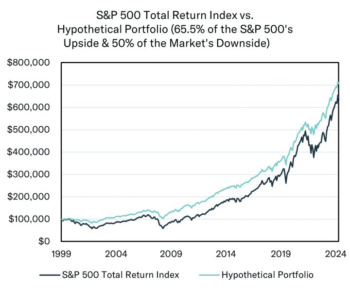
These are not real investments. This is created for illustrative purposes only.
I’ve chosen to revisit this hypothetical scenario once more to highlight the pros and cons of consistency as well as the pitfalls of short-termism. Comparing the two portfolios, and in hindsight, it seems obvious that we would all choose the Hypothetical Portfolio. Not only does it beat the S&P, but it does so with less volatility and less drawdown, which likely would mean less pain to the hypothetical investor in this Hypothetical Portfolio.
However, the Hypothetical Portfolio only beat the Index 9 times since 1999 on a yearly basis, and only once in the past five years. In fact, it routinely trails the index by 5-10% on a yearly basis. Sometimes, even more than that. In this light, it would seem that the Hypothetical Portfolio might be unacceptable to most investors. Why trail the index for four of the past five years when one could just be invested in it? One might conclude that the Hypothetical Portfolio has lost its way, and it would be better to just go with the index. That sort of short-termism (with the benefit of hindsight) would clearly have led to a less successful experience between the S&P 500 and its Hypothetical counterpart. Why? Because consistency matters. Not losing as much matters. Sequence of returns matter.
By losing less during bad years, the Hypothetical Portfolio compounds from a higher place. It achieved a superior outcome because of the sequence of returns leading to a better overall growth experience. By declining less, the Hypothetical Portfolio has a higher base to grow from after down years, therefore it does not need the same percentage return as the S&P 500 to grow a similar dollar amount. Said another way, by the end of 2002, a $100,000 investment in S&P 500 had drawn down to $62,414. The Hypothetical Portfolio drew down to just $87,676. In 2003, the S&P 500 roared back, gaining nearly 29% while the Hypothetical gained just 19%. However, the 19% growth in the Hypothetical led to a dollar return of nearly $17k because it was starting with $87,676. Meanwhile, the S&P 500 portfolio would have grown just over $17k as well because it started the year with $62,414. Dramatically different returns, 29% versus 19%, but similar dollar returns thanks to the sequence of the preceding returns.
Short-termism can sometimes be our worst enemy as investors. It often leads to FOMO. As investors, we see the 29% return and naturally think that is better than the 19% from the Hypothetical Portfolio. And, viewed through just the lens of that year, it would be hard to push back against that conclusion. However, it’s a little like thinking my friend is the far superior runner by looking at the race just when he is sprinting. By looking at just a slice of the race, we can fail to account for the bigger picture. We fail to account for the sequence of returns by instead focusing on returns in a given quarter or given year. And remember, by losing less one does not have to make as much during up markets!
Share:
Disclaimer: Tandem Investment Advisors, Inc. is an SEC registered investment advisor.
This audio/writing is for informational purposes only and shall not constitute or be considered financial, tax or investment advice, or an offer to sell, or a solicitation of an offer to buy any product, service, or security. Tandem Investment Advisors, Inc. does not represent that the securities, products, or services discussed in this writing are suitable for any particular investor. Indices are unmanaged and not available for direct investment. Please consult your financial advisor before making any investment decisions. Past performance is no guarantee of future results. All past portfolio purchases and sales are available upon request.
All performance figures, data points, charts and graphs contained in this report are derived from publicly available sources believed to be reliable. Tandem makes no representation as to the accuracy of these numbers, nor should they be construed as any representation of past or future performance.
Insightful Updates
Delivered
Timely and engaging information—right to your inbox.
More Commentary
Observations
U.S. equities closed January on a notably positive note after a challenging December, as a broad-based rally lifted key indices within spitting distance of all-time highs. The S&P 500 advanced by 2.70%, the Nasdaq climbed 1.64%, and the Russell 2000 recovered with...
Notes from the Trading Desk
All major U.S. equity indices closed out the month of January higher. The S&P 500 advanced 2.70%, while the Dow Jones Industrial Average and Nasdaq gained 4.70% and 1.64%, respectively.
Notes from the Trading Desk
U.S. stocks have stumbled out of the gate to start 2025, with the S&P 500 and Nasdaq both registering back-to-back weekly losses in the first two weeks of the year. The S&P 500 declined 1.94% last week, its fourth weekly decline in...